 |
| Source - http://www.redmondpie.com/samsung-takes-a-swipe-at-iphone-5-with-their-new-print-ad-for-galaxy-s-iii/ |
Sunday, 21 October 2012
Samsung vs. Apple (round 2)
Lego and the Olympics
 |
| Source - http://www.fastcocreate.com/1681309/the-12-best-ads-of-the-2012-olympics |
Really fun ad campaign. Lego promoting team GB in the London Olyimpics. A play of words in "Great building, Great Britain". The lego athletes shown are all supporting gold medals promoting team GB in a positive way.
 |
| Source - http://www.fastcocreate.com/1681309/the-12-best-ads-of-the-2012-olympics |
Awesome posters!
 |
| source - http://www.itsnicethat.com/articles/absolut-network-forma-and-co |
Incredible posters produced by design firm Forma & Co, founded by Joel Lozano and Dani Navarro.
 |
| source - http://www.itsnicethat.com/articles/absolut-network-forma-and-co |
I really like the simplicity of these posters. The design is clean and well presented. The colour contrast is good and it makes the design/text really stand out. I'm quite fond of the bright bold colours used in the posters. Although I don't understand Spanish the design language is universal and anything this good deserves a mention in my blog!
 |
| source - http://www.itsnicethat.com/articles/absolut-network-forma-and-co |
Google wonderland..
 |
| Source - http://www.itsnicethat.com/articles/connie-zhou-where-the-internet-lives |
 |
| Source - http://www.itsnicethat.com/articles/connie-zhou-where-the-internet-lives |
 |
| Source - http://www.itsnicethat.com/articles/connie-zhou-where-the-internet-lives |
MAD

This is the work of design collective 'Pentagram', (this particular project was headed by Michael Beirut). The above image is the typeface or logo for the Museum of Arts and Design in New York. 'MAD' is an acronym for the museum name.

Pentagram were approached by the Museum to give them a new identity and image. They created the 'MAD' typface that is associated with the museum. The typeface is based on the idea of every letter in the alphabet being made up of purely a combination of 2 shapes, cirles and squares. This resulted, in my opinion, a very strange and unique design. The letters were very obscure and hard to read, characteristics that are not desirable when creating a typeface in a technical point of view, but because of this fact it did draw my attention to it. The typeface itself has a very urban modern finish to it while being totally unique and unlike anything else. The acronym 'MAD' for the museum also fits the characteristics of the typeface as its outlandish and alien. It stands out from any other typeface I've ever seen. I think that the mood and the sense of uniqueness that the typeface gave acomplished Pentagrams goal of creating a new identity for the museum while grabbing people's attention with the very distinctive style and design.

Some 'MAD' lettering on a New York bus.

Leaflets and booklets created for the Museum of Arts and Design.
All images from - http://new.pentagram.com/2008/09/new-work-museum-of-arts-and-de/
Sunday, 14 October 2012
CMYK
Bold, minimalistic.
 |
| source - http://find-the-in-between.deviantart.com/art/CMYK-Wallpaper-174851271?qj=1&q=favby%3Atorado%2F8514350&qo=302 |
Green pizza anyone?
 |
| Source - http://10steps.sg/inspirations/artworks/44-advertising-posters-with-clever-ideas/ |
 |
| Source - http://10steps.sg/inspirations/artworks/44-advertising-posters-with-clever-ideas/ |
Now that's real HORSEPOWER!
Nature meets Machine. The synergy between the horse and the motorcyle is great. I like how the horse just flows into and merges with the mechanical parts, it doesn't seem forced together. The sense of speed is within the image is subtly created with the use of soft blurs, note how the bike wheel seem to be spinning fast and the horse legs to be moving, very effective. I also like the attention to detail, both the horse half and the bike half is black and the highlights red, strengthening the link between the horse and the motorcyle.
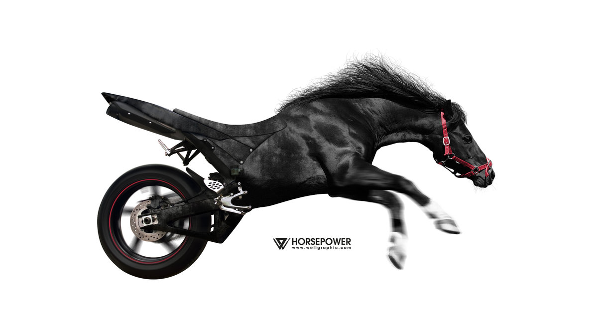 |
| Source - http://inspirationfeed.com/photography/45-visionary-examples-of-creative-photography-11/
|
Nature meets Machine. The synergy between the horse and the motorcyle is great. I like how the horse just flows into and merges with the mechanical parts, it doesn't seem forced together. The sense of speed is within the image is subtly created with the use of soft blurs, note how the bike wheel seem to be spinning fast and the horse legs to be moving, very effective. I also like the attention to detail, both the horse half and the bike half is black and the highlights red, strengthening the link between the horse and the motorcyle.
"One simple miss can make one big mess"
Honda advertising thier new "compact navigation systems" in cars. Fresh, humorous and effective.

Tuesday, 9 October 2012
Pay for a cookie with a SMILE??!?
http://www.youtube.com/watch?feature=player_embedded&v=-cRXRxepsKo
This is "Project Change" an advertising campaign made for EURO RSCG Australia (that is a worlwide marketing agency based in Australia) who were going through a rebranding phase (they are now known as Havas Worldwide). So anyway, the idea of Project Change was to bring about some positivity in people in Austrailia who commute to work. The team at Havas found that 97% of Australians are unhappy commuting. After some headscratching they decided that the best way to change the average commuter's moods were to give away free (more or less) cookies to anyone who has the ability to smile! Yes SMILE!
They started off by baking several hundred cookies and then going around in an old ford mustang in the streets of Sydney, Melbourne and Brisbane, “selling” the cookies for smile, crazy right?
I think this concept is cool as its is a very unique way of promotingt a brand that has just had an identity change. The simple idea of giving away cookies for practically free to promote a brand seems a bit unorthodox but it brought about some happiness to the people commuting to work and a positive association with the brand, definitly some good exposure. Now if only I could "buy" some cookies with a smile on my way to uni everyday...
 |
This is "Project Change" an advertising campaign made for EURO RSCG Australia (that is a worlwide marketing agency based in Australia) who were going through a rebranding phase (they are now known as Havas Worldwide). So anyway, the idea of Project Change was to bring about some positivity in people in Austrailia who commute to work. The team at Havas found that 97% of Australians are unhappy commuting. After some headscratching they decided that the best way to change the average commuter's moods were to give away free (more or less) cookies to anyone who has the ability to smile! Yes SMILE!
 |
| http://www.creativeguerrillamarketing.com/guerrilla-marketing/project-change-pay-for-a-cookie-with-a-smile/ |
They started off by baking several hundred cookies and then going around in an old ford mustang in the streets of Sydney, Melbourne and Brisbane, “selling” the cookies for smile, crazy right?
I think this concept is cool as its is a very unique way of promotingt a brand that has just had an identity change. The simple idea of giving away cookies for practically free to promote a brand seems a bit unorthodox but it brought about some happiness to the people commuting to work and a positive association with the brand, definitly some good exposure. Now if only I could "buy" some cookies with a smile on my way to uni everyday...
Subscribe to:
Comments (Atom)