 |
| Source - http://www.adweek.com/news/advertising-branding/ad-day-comcast-143725 |
Sunday, 9 December 2012
Comcast
Video - http://www.youtube.com/watch?feature=player_embedded&v=qHMml2c_eG8
Comcast is out with some new ads from The Martin Agency that claim signing up for the company Xfinity service couldn't be easier. Or at least, that it's less hard than some of the hardest things in the world.
Super Glue
 |
| Source - http://www.sopstance.com/online/wp-content/uploads/2012/02/supa03.jpg |
Igloo
"Interbrand Australia has created Igloo, a new pay-as-you-go TV product launched by broadcasters Sky New Zealand and TVNZ"
Interbrand Australia creative director Mike Rigby says ‘our idea was to create a new species of creatures called Igloo, who are eager to breathe new life into homes across New Zealand. They love to entertain and even speak their own language (Iglish).
I like how they managed to create characters out of a very generic shape while giving each its own unique personal look.
 |
| Source - http://www.designweek.co.uk/news/interbrand-australia-creates-igloo-for-sky-new-zealand-and-tvnz/3035711.article |
 |
| Source - http://www.designweek.co.uk/news/interbrand-australia-creates-igloo-for-sky-new-zealand-and-tvnz/3035711.article |
I like how they managed to create characters out of a very generic shape while giving each its own unique personal look.
London - Oxford Street Christmas Lights
 |
| Source - http://www.designweek.co.uk/designing-oxford-streets-christmas-lights/3035554.article |
Weightwatchers
 |
| Source - http://www.designweek.co.uk/news/pentagram-overhauls-weight-watchers/3035714.article |
 |
| Source - http://www.designweek.co.uk/news/pentagram-overhauls-weight-watchers/3035714.article |
I think the final design is quite effect as the gradiend indictates a change over time, something which the weightwathcres programme strives to do in people, change thier weight over time for the good.
I think the colourful gradients also added the fun positive aspect in as bright colours are usually asscosiated with young people (youth) who tend to be fit and healthy.
iPhone 5
Video - http://www.youtube.com/watch?v=A1Rc4MDmr8o&feature=player_embedded
Apple explaining how its 'common' sense approach to the iPhone 5 is what make its so great.
 |
| Source - http://www.adweek.com/news/advertising-branding/ad-day-apple-143957 |
What if Lightlife had a farm..
Video - http://www.youtube.com/watch?feature=player_embedded&v=IlY4Uu6exnA
Lightlife, a ConAgra purveyor of meatless foods, launched this stop-motion animated online ad last week from Venables Bell & Partners imagining a fairy-tale plot of land where all the livestock have been replaced with versions of themselves constructed entirely out of edible flora. Set to a takeoff on "Old McDonald Had a Farm," the ad, paints a picture of a place that is an environmentally friendly, slaughterless paradise for vegetarians. They succeed in painting an overall picture of an earth-and-animal-loving ethos that's sure to resonate with the hard-core element of the brand's target market of vegetarians.
 |
| Source - http://www.adweek.com/news/advertising-branding/ad-day-lightlife-143977 |
Facebook - Chairs
Video - http://www.adweek.com/news/advertising-branding/ad-day-facebook-144194
The ad begins with an iconic-looking image of a chair levitating in a forest, a human artifact carved from the nature behind it, and then shows people of all colors and cultures sitting in them. The narrator then starts comapring chairs with facebook.
"Chairs are made so that people can sit down and take a break. Anyone can sit on a chair. And if the chair is large enough, they can sit down together. And tell jokes. Or make up stories. Or just listen. Chairs are for people. And that is why chairs are like Facebook."
The ad then goes onto say how facebook is also like bridges and dance floors, it gets people together so that they can connect and socialise.
I like the disctinction they made between what is man made (chairs, bridges, dancefloors, facebook) and related it with something natural (people). The ad perfectlly tell the audiesnce of what facebook does, its a place where people can go on to meet new people and socialise by making the link between what it does with something physical (chairs ect..).
 |
| Sourse - http://www.adweek.com/news/advertising-branding/ad-day-facebook-144194 |
"Chairs are made so that people can sit down and take a break. Anyone can sit on a chair. And if the chair is large enough, they can sit down together. And tell jokes. Or make up stories. Or just listen. Chairs are for people. And that is why chairs are like Facebook."
The ad then goes onto say how facebook is also like bridges and dance floors, it gets people together so that they can connect and socialise.
I like the disctinction they made between what is man made (chairs, bridges, dancefloors, facebook) and related it with something natural (people). The ad perfectlly tell the audiesnce of what facebook does, its a place where people can go on to meet new people and socialise by making the link between what it does with something physical (chairs ect..).
Smirnoff - Nocturnal Awakening
Video - http://www.youtube.com/watch?v=QnW5MRwNf0Y&feature=player_embedded
The ad has some pretty stunning images. The red silk flower, the bursting fruit, the cloud of crimson smoke all make a strong visual impact. The colour Red is very apparent in this add as it of course is related to the Smirnoff logo.
The ad is also showing young people having fun which would translate into saying, drink Smirnoff have a laugh in the real world. There is also a lot of things getting thrown and splattered across walls, floors, suggesting that the drink is strong in alcahol content.
 |
| Source - http://www.adweek.com/news/advertising-branding/ad-day-smirnoff-144285 |
The ad is also showing young people having fun which would translate into saying, drink Smirnoff have a laugh in the real world. There is also a lot of things getting thrown and splattered across walls, floors, suggesting that the drink is strong in alcahol content.
Nike - Extra 5 years
Video - http://www.youtube.com/watch?v=JGskDRV4t0g&feature=player_embedded
"For the first time ever, the current generation of children is expected to have a shorter life expectancy than their parents. (Told you it was depressing.) Five years shorter, to be exact"
To bring attention to the issue, Nike partnered with Wieden + Kennedy in Portland, Ore., to produce this short video, which recently premiered at the annual Clinton Global Initiative meeting in New York. The spot asks kids what they would do with five extra years. Their responses range from ambitious "Build a time machine," "Go looking for dark matter" to the more serious"Make medicine for the sick".
This ad is showing how Nike cares for the new generation as they are bringging this issue to attention, trying to help the children.
 |
| Source - http://www.adweek.com/news/advertising-branding/ad-day-nike-144025 |
To bring attention to the issue, Nike partnered with Wieden + Kennedy in Portland, Ore., to produce this short video, which recently premiered at the annual Clinton Global Initiative meeting in New York. The spot asks kids what they would do with five extra years. Their responses range from ambitious "Build a time machine," "Go looking for dark matter" to the more serious"Make medicine for the sick".
This ad is showing how Nike cares for the new generation as they are bringging this issue to attention, trying to help the children.
Bespoke hand-drawn type
 |
| Source - http://www.itsnicethat.com/articles/word-up |
 |
| Source - http://www.itsnicethat.com/articles/word-up |
I really like her hand drawn type. It has a really playfulk and fun expression to it. The brightly coloured backgrounds against the black type just helps makes the type really stand out.
Hearing Aids
 |
| Source - http://blog.karachicorner.com/2012/01/60-dazzling-advertising-posters/ |
Fish Fillet Tank
 |
| Source - http://blog.karachicorner.com/2012/01/60-dazzling-advertising-posters/ |
MATTEL TOYS
 |
| Source - http://blog.karachicorner.com/2012/01/60-dazzling-advertising-posters/ |
Romanya
 |
| Source - http://blog.karachicorner.com/2012/01/60-dazzling-advertising-posters/ |
Guitar Repair
 |
| Source - http://blog.karachicorner.com/2012/01/60-dazzling-advertising-posters/ |
This poster is a great parody of the album cover London Calling by English Punk band The Clash, and the message is they are trying to communicate is self explanatory, they fic guitars, the pillow os there to take the blow from the guitar and reduce its impace so it doesn't break.
I really like the illustrative feel to the poster. The various lines and scribbles in the shading and around the sides really creates a sense of depth and grittyness.
McDonald's 24 hours
 |
| Source - http://blog.karachicorner.com/2012/01/60-dazzling-advertising-posters/ |
Despite the fact the McDonald's effectly communicate thier message in thsi ad poster I dislike the way it has been put together, the McDonalands fries bo/wall looks as if its been just tacked on rather than seemlessly merge in with the photo (background - plugs).
Fiat sends out a powerful message
 |
| Source - http://blog.karachicorner.com/2012/01/60-dazzling-advertising-posters/ |
Life's twists and turns
 |
| Source - http://blog.karachicorner.com/2012/01/60-dazzling-advertising-posters/ |
Texting while driving
 |
| Source - http://blog.karachicorner.com/2012/01/60-dazzling-advertising-posters/ |
Man & Machine in perfect harmony
 |
| Source - http://blog.karachicorner.com/2012/01/60-dazzling-advertising-posters/ |
Audi + El Classico
 |
| Source - http://blog.karachicorner.com/2012/01/60-dazzling-advertising-posters/ |
Lego Simpsons
 |
| Source - http://www.andrewkelsall.com/imaginative-lego-ad-campaign/ |
LG - Big enough to tackle both teams at once
 |
| Source - http://www.dandad.org/awards/professional/2012/categories/outa/outdoor-advertising/01083/rugby-tunnel |
 |
| Source - http://www.dandad.org/awards/professional/2012/categories/outa/outdoor-advertising/01083/rugby-tunnel |
Adidas - Take the stage
 |
| Source - http://www.creativereview.co.uk/images/uploads/2012/08/adidas_new_1.jpg |
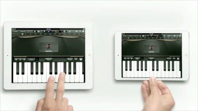
iPad Mini
Video - http://www.youtube.com/watch?v=l5J908SxAgA&feature=player_embedded
Simple yet effective. This add perfectly portrays the new iPad mini tablet from Apple. Its small and lighter, which is presented metaphorically in the ad with the use of musical tones. the larger heavier iPad is playing the deaper heavier notes whereas the iPad mini is playing the smaller lighter notes.
The overall finish of the add is also very in the form of other Apple ads with the prevalent use of whites to represent something new and pure and perfect.
 |
| Source - http://www.adweek.com/news/advertising-branding/ad-day-apple-144743 |
Simple yet effective. This add perfectly portrays the new iPad mini tablet from Apple. Its small and lighter, which is presented metaphorically in the ad with the use of musical tones. the larger heavier iPad is playing the deaper heavier notes whereas the iPad mini is playing the smaller lighter notes.
The overall finish of the add is also very in the form of other Apple ads with the prevalent use of whites to represent something new and pure and perfect.
Sony Experia goes undercover
Video - http://www.youtube.com/watch?v=Yg8aYw-ODyk&feature=player_embedded
Sony promoted thier new waterproof smartphone in junction with the opening screening of new James Bond film, Skyfall. In the ad the Cinema viewers were given free drinks of which some contained a brand new Sony Xperia smartphone. All the phones were then rang, the lucky cinema ongoers were surprised to find a brand new, perfectly working and intact phone soaked in thier drink.
I really like the way Sony has advertised thier p[roduct in a more practical way by conducting this 'test'. The phones ringing and working afterwards while soaked in a fizzy drink implicates how robust the smartphone really is and that its water proof.
 |
| Source - http://www.adweek.com/news/advertising-branding/ad-day-sony-xperia-145081 |
I really like the way Sony has advertised thier p[roduct in a more practical way by conducting this 'test'. The phones ringing and working afterwards while soaked in a fizzy drink implicates how robust the smartphone really is and that its water proof.
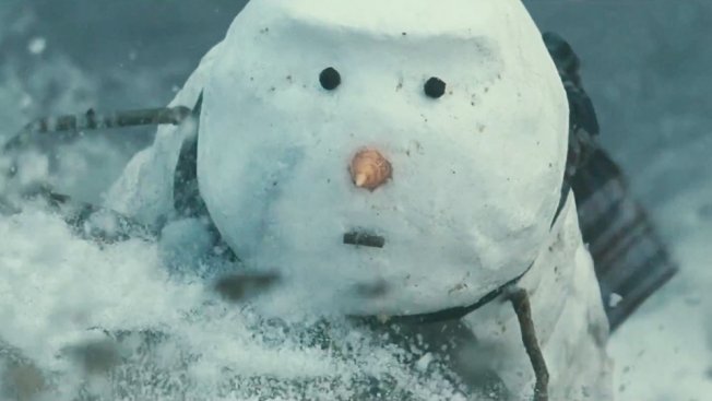
A John Lewis Christmas
Video - http://www.youtube.com/watch?feature=player_embedded&v=0N8axp9nHNU
This adfrom John Lewis is pure fantasy, starring a countryside snowman who will travel to the ends of the earth to show the depths of his love for his snowwoman. The ad is making a emphasis on love during the christmas period.
 |
| Source - http://www.adweek.com/news/advertising-branding/ad-day-john-lewis-145103 |
Red Bull Energy
Video - http://www.youtube.com/watch?v=M0jmSsQ5ptw&feature=player_embedded
I am simple in awe in how Red Bull managed to pull this ad off (probably with some clever editing techniques, but nonetheless the final piece is still impressive). Red Bull is the biggest energy drink company in the world, but it had far expanded beyonf just energy drinks now. Red Bull is known linked to all major extreme sports and motorsports like Formula 1.
Here in the ad Red Bull is creating a sense of thrill and speed with all the fast moving objects, tricks and quick editing. The ad is the embodiment of Red Bull. Red Bull stands for energy, speed, power, acceleration, adreneline fueled stunts. The ad encapsulates all those things in some way and links it all together too with each stunt being part of the next.
 |
| Source - http://www.adweek.com/news/advertising-branding/ad-day-red-bull-145166 |
I am simple in awe in how Red Bull managed to pull this ad off (probably with some clever editing techniques, but nonetheless the final piece is still impressive). Red Bull is the biggest energy drink company in the world, but it had far expanded beyonf just energy drinks now. Red Bull is known linked to all major extreme sports and motorsports like Formula 1.
Here in the ad Red Bull is creating a sense of thrill and speed with all the fast moving objects, tricks and quick editing. The ad is the embodiment of Red Bull. Red Bull stands for energy, speed, power, acceleration, adreneline fueled stunts. The ad encapsulates all those things in some way and links it all together too with each stunt being part of the next.
A winter tale
Video - http://www.youtube.com/watch?v=9RZPmKC2c2o&feature=player_embedded
Cartier - A winter tales shows the journey of leopard through a snow covered forest. Its shows the cat go through the forest and looking at some visually awe inspiring scenes. Everything in the ad seems unreal, just like a fairytale. I really like the technical aspect of this ad, the animations themselves. The creatives managed to find the right balance between realism and surrealism in the way the whole ad was put together along woth all the animations and special effects.
The add itself says a lot about the brand Cartier, it is a luxury brand. This association with luxury is made with the extensive use of gold and jewellery.
 |
| Source - http://www.adweek.com/news/advertising-branding/ad-day-cartier-145412 |
The add itself says a lot about the brand Cartier, it is a luxury brand. This association with luxury is made with the extensive use of gold and jewellery.
Coca Cola - together we can make magic happen
Video - http://www.youtube.com/watch?v=RE4ws7B7yTg&feature=player_embedded
"Coke has a fairly robust claim to the modern-day image of Santa Claus, having been among the first companies (though not the first) to feature the red-and-white version of St. Nick in its ads, back in the 1930s. The new spot, though, while making Santa even larger than life, manages to make him less lifelike than ever".
This coca cola ad is targeted at the modern audience or those 'who don't believe'. The ad is saying that people don't need to see the real santa to believe in christmas rather a big fake artificial one roaming the streets to get everyone TOGETHER excited and happy for christmas is all that one needs to get the spirit of christmas. The idea of togetherness is central in this ad as essentially christmas is a time when people spend a lot of time wither thier families and other intimate relations. I really like the ad and how it manages to encapsulate all the moments of joy and happiness in the people in the streets. It really gives a sense of joy and exitement, getting people ready for the christmas period and of course promoting the coke brand itself which has grown to be synonomously linked with Santa Claus/Christmas.
 |
| Source - http://www.adweek.com/news/advertising-branding/ad-day-coca-cola-145441 |
This coca cola ad is targeted at the modern audience or those 'who don't believe'. The ad is saying that people don't need to see the real santa to believe in christmas rather a big fake artificial one roaming the streets to get everyone TOGETHER excited and happy for christmas is all that one needs to get the spirit of christmas. The idea of togetherness is central in this ad as essentially christmas is a time when people spend a lot of time wither thier families and other intimate relations. I really like the ad and how it manages to encapsulate all the moments of joy and happiness in the people in the streets. It really gives a sense of joy and exitement, getting people ready for the christmas period and of course promoting the coke brand itself which has grown to be synonomously linked with Santa Claus/Christmas.
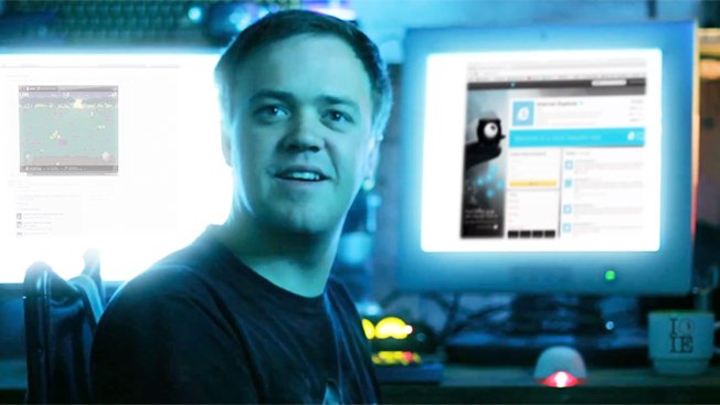
Internet explorer sucks... less
 |
| Source - http://www.adweek.com/news/advertising-branding/ad-day-internet-explorer-145546 |
This is a viral ad promoting Microsofts new Internet Explorer 10. IE (short for Interenet Explorer), has in the past been known for being highly unreliable and unstable. Microsoft is taking the fun out of itself in this ad to promote its latest web browser. The ad depicts the common interenet troll claiming how everything IE sucks but in the end changes his mind saying how it sucks less. The words then progress appears. Here Microsoft acknowledging the fact that thier very old browsers were not up to par but thier latest one is much better even though people still talk negative things about it. In this ad Microsoft wants to change people perception of IE more than actually broting IE itself which it of course is still doing, but the perception of people beliefs is what they are aiming to change.
I really admire microsft for thier very bold move of taking responsibilty and blame on themselves for past mistakes as it shows that a huge corporation like Microsoft who makes billions still do care for everyone of thier consumers and want to change thier ways for the better.
Don't get SCROOGLED!
 |
| Source - http://rack.1.mshcdn.com/media/ZgkyMDEyLzExLzI4LzExXzE5XzA4XzMwNl9maWxl/a23a4399 |
Microsoft have recently attacked google's search engine claiming how they 'scroogle' us, a fun play on words indicating how google is screwing users with thier shopping search system and how it is not entirely 'givng the best results' rather displaying shopping items that will give google the maximum revenue. Microsoft then claim that Bing is a more honest search engine, one that does not have any 'paid ads' as they are called.
I think this is an interesting battle as Google is still by at large the most popular search engine. Microsoft are trying to promote thier search engine by exploiting the Google search engine (how it really isn't perfect). Who knows Bing may become the biggest search engine in the future?
Catwoman breast cancer
 |
| Source - http://jimstrutzin.hubpages.com/hub/15-Best-Print-Ads-of-2011# |
The ad is using a comicbook superhero (Catwoman) shown to be checking her breasts to check for signs of breast cancer. The tagline 'nobody is immune to breast cancer' fortifies this belief that no matter how strong or well off you are anyone can get breast cancer, even a super hero with super powers or special abilities such as Catwoman. I think they communicate the thier message well even though at first glance its not so obvious. Once you understand the concept you immediately realise the true message however the only criticism for this ad would be that if people did not know the reference of the super hero they would not understand the true messege of the ad which is to raise the awareness of breast cancer and how it is a serious threat that can affact anyone.
Safe cleaver
 |
| Source - http://jimstrutzin.hubpages.com/hub/15-Best-Print-Ads-of-2011# |
I really like the idea behind this ad. The fact that its displaying a very dangerous object, a meat cleaver, is ironic as the purpose of the ad is to promote how safe play-doh is just makes the message more clear and bold. It also ties in well with the tagline that no matter how dangerous the copied object is (in this case a meat cleaver) the play doh version will always be safe.
White & Black Coffee
 |
| Source - http://jimstrutzin.hubpages.com/hub/15-Best-Print-Ads-of-2011# |
Central to the ad poster above are two nude people, a black male and white female. Thier skin colour is representing the colour of the coffee. The fact that thier nude also adds sensual flair to the poster, telling the audience that the Coffee is excellent and enjoyable just as sex is. I like how they have made a shape of a coffee cup with the people. The overall design is very neat and clean, it does not have any clutter and the message is communicated very effectively.
Are you in the right job?
 |
| Source - http://jimstrutzin.hubpages.com/hub/15-Best-Print-Ads-of-2011# |
Monster.com is a job search website that allow people to find a job suited based on thier qualification and skills. This print ad is promoting the sevice in a very unique and interesting way. It is showing a pink ballerina in a army man toy form (holding a gun despite not being a soldier) withing a bag of other actual army men toys. The ballerina stands out from the other toys as even though it is holding a gun and doing the same 'job' as the other green army men, it is different in colour and the uniform differs too. This is indicating how we could be in a job that we're not really built for or like doing, and that monster.com can help find the people in the 'ballerina' situation the right job. I like the fact that how creative they were in thier approach to the ad, its very clever way of sending out a simple message, go to our site, find the right job.
Doritos, Mountain Dew and Halo 4!
Halo 4 has been a huge success. It is one of the highest selling video games of all time. 343 industries (Halo 4 creatives) has teamed up with Doritos and Mountain Dew to promote the game as well as give some of the exposure to Mountain Dew and Dotitos. All the products displayed promote 'ex points' which is something realted to the game itself. I like the idea that the Mountain Dew and Doritos have made something that consumers can interact with and get some 'double xp' in Halo 4. This creates some sort of common link between the products. Interactive advertising gets the consumer to be more involved in a product which helps promote the video game Halo 4 further as well as Mountain Dew drinks and Doritos crisps. In the end people may just end up buying the snacks just for the 'double ex' feature alone.


Sunday, 11 November 2012
Triangle, Circle, Cross, Square
 |
| Source - http://jimstrutzin.hubpages.com/hub/15-Best-Print-Ads-of-2011 |
Movember
As you all know Movember which raises funds and awareness for prostate and testicular cancer by encouraging men to grow moustaches takes part during the month of November. Digital consultancy 'Twentysix' is planning on raising some money for Movember by selling the artwork of 180 artists who wants to help contribute to this fund raising event.
 |
| Source - http://www.designweek.co.uk/whats-on/gallery-of-mo/3035474.article |
 |
| Source - http://www.designweek.co.uk/whats-on/gallery-of-mo/3035474.article |
 |
| Source - http://www.designweek.co.uk/whats-on/gallery-of-mo/3035474.article |
"Christopher Porter" by Jack Hughes.
Environmentally friendly fishnet
In a world we live in today, environmental issues are a hot topic, from global warming to melting polar ice caps. Its a big deal for us all. However other aspects such as animals are also considered part of our environment as wilflife.
UK Designer Dan Watson (a Royal College of Art graduate) has won the international James Dyson award for his 'SafetyNet' design. It is basically a glowing ring that attatches to a fishing net that allows juvenile and unmarketable fish to escape. It acts like an emergency exit sign for fish.
Why is this significant? It is significant because right now nearly half of the fish that are caught with conventional fishing nets are thrown back into the sea, as they are either too small/still at a young age, but many don’t survive. The safety rings (SafeNet) allows for a small gap for the small/young fish to escape without putting them in harm while being samll enough to keep the desirable fish trapped in the net. Not only is this helping the small/juvenile fish but also the fisherman, as thier effiency to catch marketable fish will increase.
 |
| Source - http://www.designweek.co.uk/news/uk-designer-wins-international-james-dyson-award/3035548.article |
 |
| Source - http://www.designweek.co.uk/news/uk-designer-wins-international-james-dyson-award/3035548.article |
Subscribe to:
Posts (Atom)